classical art

Classes in May

This is a quick reminder to all my students that I am resuming classes this Sunday, May 12, starting with Open Studios Sunday afternoon.  Open Studios will continue Sundays, Mondays, Tuesdays and Wednesdays from 2-5pm.
The combined figure class will start on Monday evening, May 13, 6-9pm.  We have a fabulous new model, Robert, and he will take us into our first three-week pose.  It’s a full class, so please arrive on time to claim your spot.
The combined portrait group will start on Wednesday evening, May 15, 6:30-9:30pm with another new model, Raven.  It’s another full class, and Raven promises to be a great model for some lovely drawings.  
There are no evening classes on a Sunday or Tuesday or Thursday evening in May.
If you have any questions, please send me an email.
Thanks, and looking forward to seeing you all again very soon !

Recommended Reading – Classical Drawing Atelier by Juliette Aristides

Some of you have been asking about books that I recommend, so here is the first one.  Probably you’ve got this one, or heard of it.  If you haven’t already done so, please get this book and go through it.  It’s got some great illustrations and outlines some atelier practices.  Fantastic resource and a good addition to your library !

It’s available at Amazon.ca
http://www.amazon.ca/Classical-Drawing-Atelier-Traditional-ebook/dp/B007QPFERQ/ref=sr_1_3?ie=UTF8&qid=1366849553&sr=8-3&keywords=aristides+atelier

Positioning the Feet on a Standing Figure

In drawing a standing figure, we aim to capture the essential gesture of the pose and the balance and rhythm of the model.  This is achieved through capturing the diagonals that represent the inclinations of the weight-bearing leg, the torso and the head.   In doing this, it is essential to locate the feet of the model accurately in vertical relationship to the torso and especially the head.  An accurate placement of the feet is critical to achieving balance.

There a number of exercises that the student can do as homework to train the eye to depict feet.  The first one is an exercise to hone our skills in planting standing feet firmly on the ground.

From many perspectives, the base of the model’s feet are not exactly horizontal, and the natural inclination for so many people, is to exaggerate the diagonal base line of the feet.  This gives the viewer an uncomfortable feeling that the model is standing on tippy-toes or even levitating.

The following are examples of feet exercises done by some of students in Florence.  I’d recommend for anyone attending drop-in life drawing sessions where the early poses are very quick, to concentrate on doing such drawings.

Block in the feet and draw in the legs up to the knees.

You can also draw a box around the feet to knee section and tone in the negative shape, in order to use the latter to check the positive shapes.

Focus on the base line of the feet (indicated by the red lines).

And secondly, focus on the distance and horizontal relationship between the two feet (indicated by the green lines).

The next post will look at exercises to be done from mastercopies.

Great Documentary to Watch

The documentary is called “Why Beauty Matters” and is a BBC Scotland production.  This was one episode in a BBC production on Modern Beauty and this one centres around the British philosopher, Roger Scruton’s impassioned case for the need to restore Beauty in our modern day world.  I first saw this video during in Florence, and it has made the rounds of ateliers and art academies on both sides of the Atlantic.  So much so, that Roger Scruton has been invited to be the keynote speaker at the next international representational art conference in 2014.

http://www.trac2014.org/speakers-2/ 

Fiona Howatt, a friend and philosophy major from St. Andrew’s University, has graciously written this synopsis of the documentary for us:

For renowned British philosopher and writer Roger Scruton, beauty is not in the eye of the beholder. It is, in fact, an objective truth which has a significant part to play in the arts and in our everyday lives. His 2009 documentary, ‘Why Beauty Matters’, is a thought-provoking essay, which argues that the modern art of the twentieth century has turned its back on beauty, inflicting a culture of degradation and ugliness on mankind in the process. As a result, Scruton maintains that we are losing beauty and, with it, the sacred meaning of life.

For over 2,000 years, beauty was deemed to be essential to our civilisation. Many philosophers argued that our pursuit of beauty shaped the world we lived in and helped us understand our own nature as spiritual and moral creatures. Beauty, therefore, is an universal need of human beings, like truth and goodness. If we ignore such a need, Scruton maintains that we are left to wander unconsoled in a vast ‘spiritual desert’, isolated and alone. 


The great artists of the past, according to Scruton, were fully aware that human lives are full of chaos and hardship. They believed that the best solution for such suffering was to make beauty the ultimate objective of art. A beautiful work of art brings consolation in sorrow and affirmation in joy. In other words, beautiful art shows us that human life has meaning and is worthwhile. Yet, at the beginning of the twentieth century, many artists had grown tired and weary of carrying out this supposedly “sacred” task. They believed that the random nature of modern life could not be redeemed or vindicated by art. Instead, art could only reflect and depict how the world really is; the here and the now with all its imperfections. 


This line of thought, according to Scruton, was set in motion by the French artist Marcel Duchamp in 1917, when he submitted the scandalous work ‘Foundation’ (a urinal signed with a fictitious signature) in an exhibition for the Society of Independent Artists. Duchamp’s submission was supposed to be a satirical attack on the world of art, designed to mock its traditional methods and its condescending attitudes. However, ‘Foundation’ was also interpreted in another way; claiming that anything can be a work of art. Scruton goes on to suggest that, thanks to Duchamp’s legacy, contemporary art has been reduced to a ‘cult of ugliness’ as art no longer required any element of skill or taste. Modern art, in other words, has become just another meaningless human gesture like laughing or shouting. 


For Scruton, creativity is the essential ingredient in every true piece of art. Creativity, he says, is about sharing; it is a call to others to experience the world as the artist sees it, to feel and understand the artist’s emotions. But creativity alone is not enough and the skill of the artist needed ‘to show the real in the light of the ideal and so transfigure it’. Scruton goes on to say that there are objective standards of beauty which have a firm foundation in our nature and that we need to search for them and incorporate them into our everyday lives.


In his documentary, Scruton looks at a number of philosophers’ views on beauty, including Plato and Kant’s, in order to reinforce his own impassioned case for the importance of beauty in art. For Plato, beauty is the sign of another and higher order and to see it was to cultivate true virtue. We human beings aspire to the eternal realm where we are united with the divine. Whilst we can not know this transcendental world directly, Plato believes that human beings may catch glimpses of ‘that heavenly sphere’ through the experience of beauty. Beauty, therefore, was considered by Plato to be a transcendental visitor from a higher realm and we can only ever contemplate its pure radiance and brilliance. Beauty, for Plato, is a path to a higher realm, and if we attempt to possess it or manipulate with it, we desecrate it, tainting its spiritual aura. 

Kant, one of the key philosophers of the Enlightenment era, claims that the experience of beauty comes when we take an disinterested attitude towards things; when we put our own interests to one side and look upon things, not in order to use them for our own ends or to satisfy some animal appetite, but to simply engage with them and endorse them for what they are. For Kant, experiences of beauty connects human beings with the ultimate question of existence, raising them to a higher level of spirituality, and delivering them from the banality of mundane experience.

So, it seems that when we examine the history of the idea of beauty, philosophers and artists had good reasons to identify the beautiful with the sacred, and to see that the need for beauty is something deep and inherent within our nature. Contemporary artists, however, look upon this notion of sacred beauty with contempt, seeing it as a mere leftover of an old fashioned way of living which has no real connection to our modern surroundings. They feel the need rebel against the traditional pursuit of beauty and they do so by treating and depicting human life in demeaning ways. For Scruton, this willful desecration by today’s artists is an denial of love and shows this postmodern era of art is an unfeeling and cruel one. As a result, our spiritual needs which are so essential to our wellbeing remain unfulfilled.


As contemporary art turned its back on beauty in its own self-indulgent pursuit of originality, Scruton argues it has become a slave to our consumer culture, feeding our animalistic addictions and appetites and wallowing in self disgust. By creating a ‘cult of ugliness’, modern art fails to satisfy any of our spiritual needs and thus leads us into a ‘spiritual desert’. The only way out of this, according to Scruton, is to reinstate beauty to its rightful position as the ultimate objective of art and at the heart of our culture.

Recently, Scruton has been announced as the keynote speaker at next year’s Representational Art Conference in California where the focus will be on the aesthetic principles and values implicit in the representational art of the 21st Century. 

Displaying some of my work

This weekend is the North Short Art Crawl in North and West Vancouver.

http://nsartcrawl.ca

There will be lots of other artists opening their studios to the public the whole weekend.

I’ve been given an opportunity to show my work and do a demo at the Music Box, 1564 Argyle Avenue, West Vancouver, on Saturday 11am-5pm.

It’s a lovely location, right on the waterfront, and I will be on the upper floor, all naturally lit from overhead skylights.

Please come and visit !

– copy after Mariano Fortuny

Centre Line on Portraits and on Figures

In the second stage of both portrait drawing and figure drawing, we are concerned with the construct of the internal anatomy.

The first and most important element to capture is the centre line.  Some of us can benefit from clarification of what this is.

In both cases, it is a construction line.  By construction, I mean that this line does not exist in reality.  We need to understand what it is, why we need it, and where to put it.

In Classical Drawing, any line that is referred to as a construction line, is one that one doesn’t exist in reality.  “Construction” means that such a line is one that we must deduce from observing clues, and that we place this line into our drawing for the purposes of placing correctly smaller forms in the right perspective.  Eventually after placing our other forms correctly, we will be erasing these construction lines.

Let’s look at these diagrams to get a better understanding.

 – Andrew Loomis, Drawing Heads and Hands

These diagrams show the same head at various angles and in various perspectives.  The centre line on a portrait is that line which divides the left side from the right side of the mask of the face.  It intersects the widow’s peak, the bridge of the nose, the philtrum, and the cleft of the chin.  When placing this line, those are the anatomical clues that we look for, and in placing this centre line, we are immediately capturing the angle and axis of the head.

The centre line does not need to intersect the ball of the nose, as that protrudes out from the front plane of the head.

The centre line, then helps us place, perpendicular to it, the eyeline, the brow line, the nose line and the lip line.

Here are some further diagrams to help us practice locating the centre line on different tilts of the head.

Gottfried Bammes, Die Gestalt des Menschen

The centre line is equally important on figures.  It divides the left and right portions of the torso and helps us locate symmetrical forms in their proper perspective.  It also enables us to capture the gesture of the pose and the major change of direction of the torso in a contraposto pose.

After placing the centre line on the figure, we can locate accurately the line just beneath the pectorals and the iliac crests.  The centre line on a torso can be traced from the pit of the neck, down the sternum, down the linia alba, to the belly-button and then to the pubic area.

Here are more diagrams from Bammes, displaying that all important centre line on both the front pose and the back pose.

Gottfried Bammes, Die Gestalt des Menschen

© Mandy Boursicot 2013

Stages of a Fully-Rendered Figure Drawing

–>

Stages of a Fully-Rendered Figure Drawing
In Classical Drawing, we are not so much drawing the figure, as drawing the light and shadow, which will reveal the human form.  This is a step-by-step approach that employs layers of increasing refinement and sophistication at each stage.  The rule is always, to go from the general to the specific, to work from the big form, to the ever-diminishing smaller and smaller forms, but to always stay in the context of the large statement.
Different stages will require a different way of seeing, and a different way of thinking, and a different way of handling our material, all of which will be covered in class time.
I have used a drawing from an unknown 19th century Portuguese academic artist for this demo.  Please excuse the graininess.  As you will see in real life in class, the original demo drawings are much smoother and much more subtlely rendered.
1.The Block-In
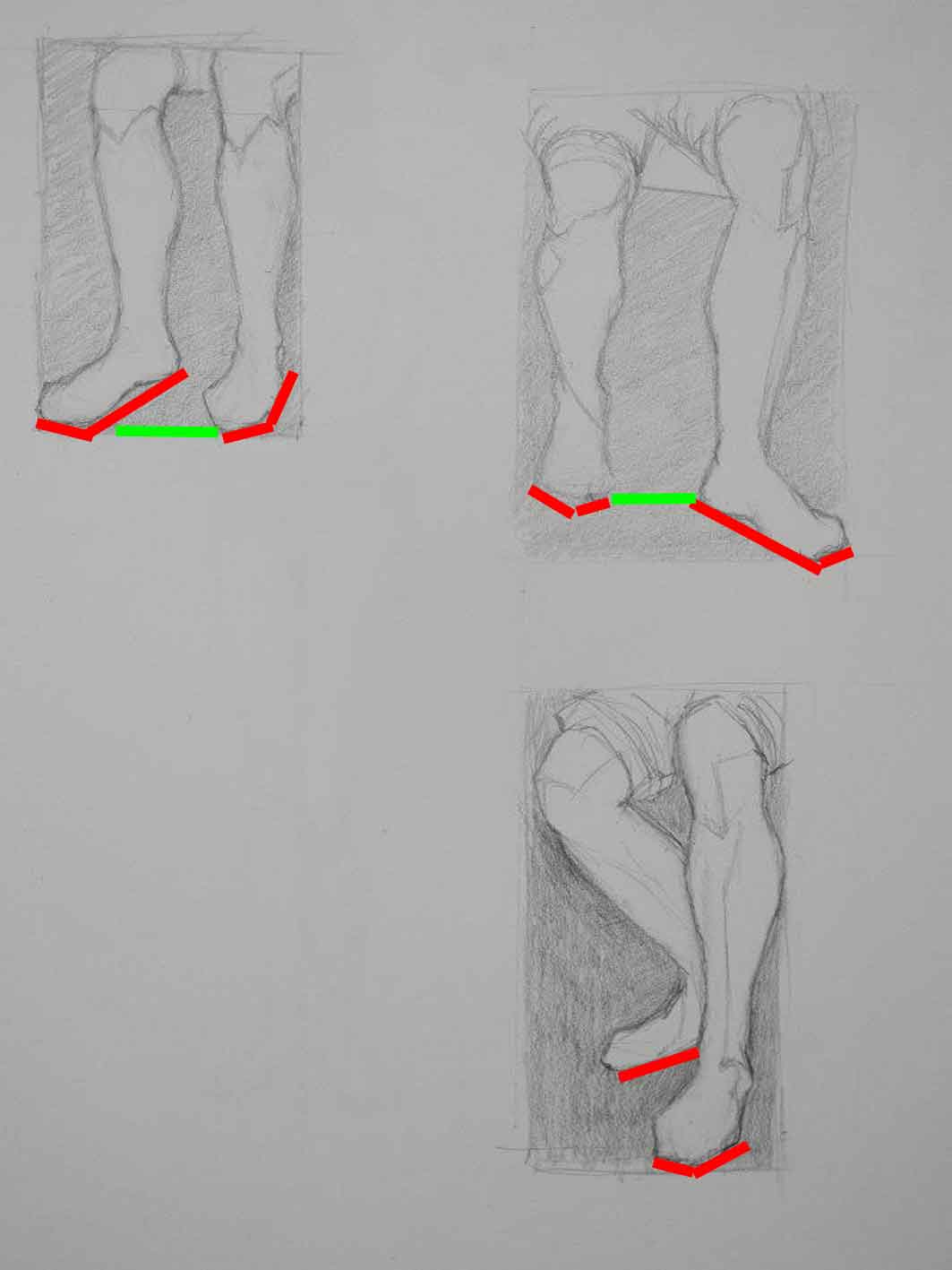
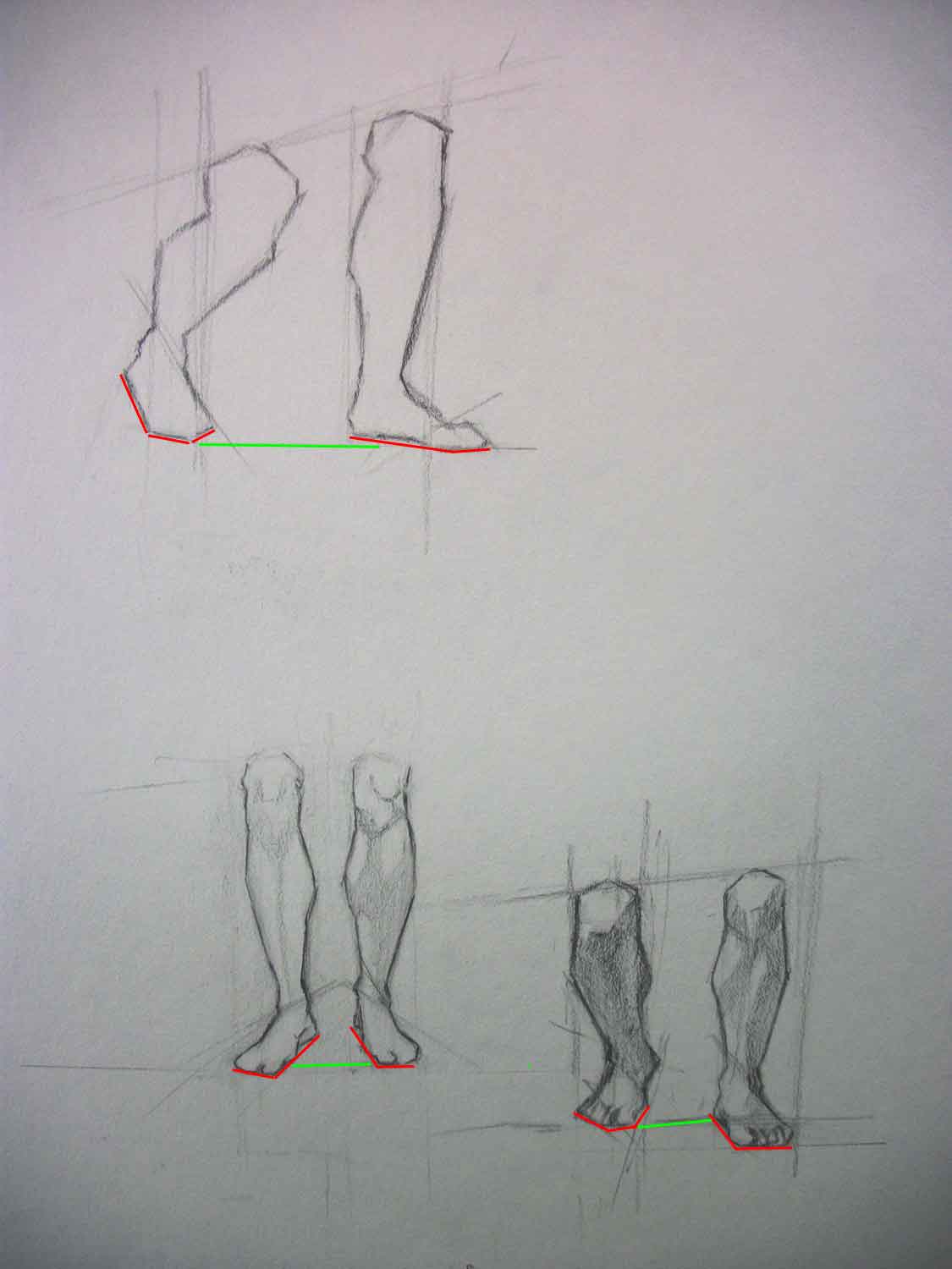
Spend the first five minutes observing the model.  Specifically we are assessing the pose and how the weight is balanced in this contraposto arrangement.  With a plumb bob, we make mental or written notes of vertical alignments, and decide which plumbline to choose for this pose.  After making a small thumbnail (about 3” high in the corner of our paper), we then set about measuring the halves and quarters on the height of the model.
Then we start the block in of our drawing.  Mark the top and bottom, and with a ruler, draw the vertical plumbline and measured quarter marks on that plumbline.
Using comparative measurements, we block in the feet, then using vertical alignments, we work our way up the legs, to the knees, which should be in the vicinity of the first quarter.  Continuing with very general envelope-type bock-in sketchy-ghosty lines, we make our way up to the hips and the major changes of direction there, then the waist and eventually to the armpits. 
Once we have reached the armpits, we start from the head down.   First the head, then the shoulders and then the arms.
© Mandy Boursicot 2013
2. The Construct
The construct stage is fairly quick, but crucial.  We observe where the centre line of the model’s torso is.  That is a construction line that starts at the pit of the neck, down the sternum, down the abs to the bellybutton, and then down to the pubic region.  This construct line will give us the gesture and swing of the torso, as well as the division of left and right for proper perspective. We can then place a line across the centre line that is the bottom of both pecs or breasts.
We will also place a centre line on the head for the centre 
© Mandy Boursicot 2013
3. The Shadow Shapes
Just as we blocked-in the outer contours in a general fashion for the first stage, this is the stage where we block-in the general idea of where the shadows will go, and then place a light tone in the shadow areas.  This tone can be #2, or #3 value.
© Mandy Boursicot 2013
4. The Articulation
We are now in a position to judge all our shapes better, because of the light tone placed into the shadow areas.  The drawing has moved from a general line drawing to one that is concerned with masses.
First we should assess whether all the large shapes are right, and make corrections to the big picture first.  We assess whether our measurements for quarters and halves were right, whether our alignments and placements of hips, waist hands were right, and most importantly, whether that top quarter has been properly apportioned to the head and shoulders.
Once those major corrections are done, we can now go through form by form, with all the smaller undulations of the shadow areas, and their corresponding light areas.  We make those smaller articulations, and tone in that shadow area darker, to a value #5 or #6.
In this stage we are creating a two-tone light-and-dark silhouette.   The two tones are the white of the paper for the lights and the #5 or #6 of the shadows.
We make no differentiation between anything in the lights, nor anything in the darks.
© Mandy Boursicot 2013
5. The Fall of Light
This stage and the next one are concerned with establishing a context for the lights only.  Not the shadows. 
The fall of light is the idea, which can readily be observed, that the brightness of the light from our single, overhead light source, diminishes as it travels further away from that source.  So the top part of our model receives brighter light and then brightness gradually drops off the further down or 6 feet model that it travels. 
So we place a smooth gradation of tone from the ankles up to the bottom of the rib-cage.
Typically down by the ankles we can start with a value #3 and gradate slowly and evenly till we get to the #1 (the white of the paper) and the bottom of the rib-cage.
© Mandy Boursicot 2013
 
6. The Big-Form Modeling
This stage is also conceptual in nature.  We should understand our guiding principle, that we always work from the biggest form, the biggest idea, the most general statement to smaller and smaller ideas, forms and details.
In this stage therefore, we need to step back from the notion that we are drawing all the details of the model in front of us, and engage our conceptual brain, that is going to see each part of the model in its most basic geometric form.
Once again, we are concerned with creating a context in our lights (not the shadows). 
Right over top of the Fall of Light (above) we model the big forms of the cylinders (all the limb segments, and the torso), the sphere, or ovoid of the head, and the semi-spheres of the shoulders, and the cubes of some of the joints, such as the knees.
This stage changes the graphic look of the previous stages to one of a volumetric statement.

© Mandy Boursicot 2013
7. Variations of the Darks
Now that we have established the context for our lights, we turn our attention back to the shadows.  In this stage, we aim to bring all our shadows to a complete finish.
We deal with the absolute darkest areas first, that is the hair in shadow.  Then we move to the bed-bug line and the turning of the outside form away from us.  There may be some more variations in the dark areas such as the armpit or a continuation of some forms such as ribs, pelvis into the shadows. 
The tonal range in the darks should be minimized, so that the viewer’s eye is less drawn to the shadows. 
Reflected lights should not be erased out of our initial shadow value, but rather, they should simply appear by virtue of the darkening of surrounding bed-bug lines, turning of the form and cast shadows.
We should pay special attention in differentiating form shadows and cast shadows and use the rules which govern each of these separately.
And we should look for opportunities to include lost edges, and soften edges where edges need to recede.
Try to simplify the darks as much as possible.
 
© Mandy Boursicot 2013
8. Rendering of the Lights
This is the final stage of the drawing, and should be the stage in which time slows down, and we focus on rendering in order, the biggest forms, the medium forms, the small forms, the micro forms and so on.
Since we have already established the general context of the lights, it’s a good strategy to develop and render each form, segment by segment, to a complete finish.
In rendering these forms, we need to be delicate and subtle, and maintain the dominance of the governing larger volumes.  Small details must always be subject to fitting into a larger context.  For each form and subsequent smaller and smaller forms that are rendered, we need to turn those forms and ensure that within its own context each form has a light, a mid- and a dark value to create the illusion of volume.
In this way we can convey the entire breadth and complexity of the human form in one drawing.

© Mandy Boursicot 2013

Follow me on Instagram!

I’ve created a new Instagram account! Find me at @mandyboursicot.

© Mandy Boursicot 2013

Class Schedule for April 2013

Here’s the class schedule for April.  Beginners’ Figure Drawing and Intermediate Portrait Drawing are already full, but I still have a couple of spots for Beginners’ Portrait and Intermediate Figure.

© Mandy Boursicot 2013

Making a Value Strip

–>

In Classical Drawing we use a range of values to convey the volume of a form.
Here we are using 9 values, from 1 to 9, where 1 is the white of the paper, and 9 is the blackest black we can achieve with our medium. 
This means that if we use white paper, or cream coloured paper, or grey paper, that #1 value will vary.  It also means that the medium we are using will determine what our #9 value will be.  If we are using 2B pencils as our darkest pencil, our #9 value can’t get quite as dark as carbon pencil, or charcoal or paint or even computer printer ink.

It’s a very valuable exercise to make our own value strip. Some of the  benefits of making our own value strip are:
we become familiar with which pencils to use
– we learn how much pencil pressure to apply
– we understand how many passes we can employ
– we exercise our pencil dexterity and become more in control of our drawing 
Here are the steps.
1.    draw on a piece of paper a strip consisting of 9 square each of ¾”, leaving a ¼” gap between the squares.
2.    Number them 1-9
3.    First work on the #9 square. Lay down many layers of 2B with some pressure on the point.  You want this to get really black.
4.    Next we will work on the number 5 square which is exactly half-way between #1 and #9.  Please check your values against these examples or the value strips given to you in class.
5.    After this we should work on number 3, which is exactly half-way between #5 and # 1.
6.    Then we focus on square number 7, which is exactly half-way between #5 and #9.
7.    Then we fill in the remaining squares that will each be respectively between the adjoining 2 values.
If you go over the edges of the squares with laying in the tones, at the end, we can use our eraser to clean up the edges.
Lastly we should spray the finished value strip, with correct values, and cut this out to have on our drawing board for future drawings.
© Mandy Boursicot 2013